


Ultimate Mechanical Countdown Timer You’ll Love with HTML, CSS & JavaScript (2025)

Table of Contents
ToggleIntroduction
Ever wanted a countdown timer that feels like a real mechanical stopwatch? One that ticks, rotates smoothly, and looks stunning with modern CSS effects? You’re in the right place!
In this guide, we’ll build a Mechanical Countdown Timer from scratch using HTML, CSS, and JavaScript. We’ll also spice it up with Tailwind CSS for styling and Tone.js for sound effects. Whether you’re a beginner developer or want to add a unique component to your portfolio, this project is both fun and practical.
Let’s get coding!
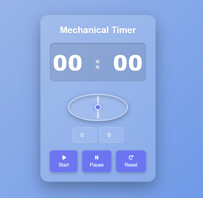
What is a Mechanical Countdown Timer?
A countdown timer counts down from a set time (e.g., 5 minutes).
A mechanical timer visually imitates an analog clock with a rotating hand.
Use cases: study sessions, workouts, cooking, live events, gaming.
Setting Up the Project
HTML Structure
Here’s our basic HTML skeleton:
					<!DOCTYPE html>
<html lang="en">
<head>
    <meta charset="UTF-8">
    <meta name="viewport" content="width=device-width, initial-scale=1.0">
    <title>Mechanical Countdown Timer</title>
    <!-- Tailwind CSS CDN -->
    <script src="https://cdn.tailwindcss.com"></script>
    <!-- Font Awesome for icons -->
    <link rel="stylesheet" href="https://cdnjs.cloudflare.com/ajax/libs/font-awesome/6.0.0-beta3/css/all.min.css">
    <!-- Tone.js for sound effects -->
    <script src="https://cdnjs.cloudflare.com/ajax/libs/tone/14.8.49/Tone.min.js"></script>
</head>
<body class="flex items-center justify-center min-h-screen">
    <div class="timer-container">
        <p class="text-3xl font-bold mb-6">Mechanical Timer</p>

        <div class="timer-display">
            <span id="minutesDisplay">00</span>
            <span class="separator">:</span>
            <span id="secondsDisplay">00</span>
        </div>

        <div class="mechanical-part-wrapper">
            <div class="mechanical-line" id="mechanicalLine"></div>
            <div class="mechanical-center"></div>
        </div>

        <div class="input-group">
            <input type="number" id="minutesInput" placeholder="Min" min="0" max="99" value="0">
            <input type="number" id="secondsInput" placeholder="Sec" min="0" max="59" value="0">
        </div>

        <div class="controls">
            <button id="startButton">
                <i class="fas fa-play"></i> Start
            </button>
            <button id="pauseButton" disabled>
                <i class="fas fa-pause"></i> Pause
            </button>
            <button id="resetButton">
                <i class="fas fa-redo"></i> Reset
            </button>
        </div>

        <div id="messageBox" class="message-box"></div>
    </div>
</body>
</html>
CSS Styling
Here’s the styling that gives our timer a glassmorphic look and smooth animations:
					    <style>
        /* Custom styles for the app */
        body {
            font-family: 'Inter', sans-serif;
            margin: 0;
            display: flex;
            justify-content: center;
            align-items: center;
            min-height: 100vh;
            background: linear-gradient(135deg, #a7bfe8, #6190e8); /* Soft blue gradient background */
            overflow: hidden;
            box-sizing: border-box;
        }

        .timer-container {
            position: relative;
            width: 380px; /* Fixed width for the timer box */
            height: 550px; /* Fixed height to accommodate elements and spacing */
            background: rgba(255, 255, 255, 0.15); /* Semi-transparent background */
            backdrop-filter: blur(10px); /* Frosted glass effect */
            border-radius: 25px; /* More rounded corners */
            box-shadow: 0 20px 50px rgba(0, 0, 0, 0.3); /* Deeper shadow */
            padding: 30px;
            text-align: center;
            display: flex;
            flex-direction: column;
            align-items: center;
            justify-content: space-around; /* Distribute space vertically */
            color: white;
            text-shadow: 0 1px 3px rgba(0,0,0,0.2);
            border: 1px solid rgba(255, 255, 255, 0.3); /* Subtle white border */
            animation: fadeIn 0.8s ease-out forwards;
        }

        @keyframes fadeIn {
            from { opacity: 0; transform: translateY(20px); }
            to { opacity: 1; transform: translateY(0); }
        }

        .timer-display {
            font-size: 4.5rem; /* Large font for time */
            font-weight: 800;
            margin-bottom: 20px;
            letter-spacing: 2px;
            display: flex;
            justify-content: center;
            align-items: center;
            gap: 10px;
            padding: 10px 10px;
            background: rgba(0, 0, 0, 0.1);
            border-radius: 15px;
            width: 100%;
            box-shadow: inset 0 2px 5px rgba(0,0,0,0.2);
        }

        .timer-display span {
            min-width: 80px; /* Ensure consistent width for digits */
            text-align: center;
        }

        .timer-display .separator {
            font-size: 3.5rem;
            animation: pulseColon 1.5s infinite alternate;
        }

        @keyframes pulseColon {
            0% { opacity: 1; }
            50% { opacity: 0.5; }
            100% { opacity: 1; }
        }

        .mechanical-part-wrapper {
            position: relative;
            width: 200px; /* Size of the mechanical part */
            height: 200px;
            margin: 20px 0;
            border-radius: 50%;
            background: rgba(255, 255, 255, 0.1);
            border: 5px solid rgba(255, 255, 255, 0.3);
            box-shadow: inset 0 5px 10px rgba(0,0,0,0.2), 0 5px 15px rgba(0,0,0,0.3);
            display: flex;
            justify-content: center;
            align-items: center;
        }

        .mechanical-line {

            position: absolute;
            width: 4px; /* Thickness of the rotating line */
            height: 90%; /* Length of the rotating line */
            background-color: #f0f0f0; /* Light color for the line */
            border-radius: 2px;
            transform-origin: center;
            transition: transform 0.1s linear; /* Smooth rotation */
            box-shadow: 0 0 10px rgba(255,255,255,0.5);
        }

        .mechanical-center {
            position: relative;
            width: 20px;
            height: 20px;
            background-color: #6366f1; /* Indigo-500 */
            border-radius: 50%;
            border: 3px solid white;
            box-shadow: 0 0 15px rgba(99,102,241,0.8);
            z-index: 1; /* Ensure it's on top of the line */
        }

        .input-group {
            display: flex;
            gap: 10px;
            margin-bottom: 25px;
            width: 100%;
            justify-content: center;
        }

        .input-group input {
            width: 80px;
            padding: 12px 15px;
            border: 1px solid rgba(255, 255, 255, 0.4);
            background: rgba(255, 255, 255, 0.1);
            color: white;
            border-radius: 10px;
            font-size: 1.1rem;
            outline: none;
            text-align: center;
            transition: border-color 0.3s ease, box-shadow 0.3s ease, background 0.3s ease;
        }

        .input-group input::placeholder {
            color: rgba(255, 255, 255, 0.7);
        }

        .input-group input:focus {
            border-color: rgba(255, 255, 255, 0.8);
            box-shadow: 0 0 0 3px rgba(255, 255, 255, 0.3);
            background: rgba(255, 255, 255, 0.2);
        }

        .controls {
            display: flex;
            gap: 15px;
            width: 100%;
            justify-content: center;
        }

        .controls button {
            padding: 12px 20px;
            background-color: rgba(99, 102, 241, 0.8); /* Indigo-500 with transparency */
            color: white;
            border-radius: 10px;
            border: none;
            cursor: pointer;
            font-size: 1rem;
            transition: background-color 0.3s ease, transform 0.2s ease, box-shadow 0.3s ease;
            box-shadow: 0 4px 10px rgba(0, 0, 0, 0.2);
        }

        .controls button:hover {
            background-color: rgba(79, 70, 229, 0.9); /* Indigo-600 with transparency */
            transform: translateY(-3px);
            box-shadow: 0 6px 15px rgba(0, 0, 0, 0.3);
        }
        .controls button:active {
            transform: translateY(0);
            box-shadow: 0 2px 5px rgba(0, 0, 0, 0.1);
        }

        .message-box {
            background-color: rgba(255, 255, 255, 0.9);
            color: #333;
            padding: 15px;
            border-radius: 10px;
            box-shadow: 0 5px 15px rgba(0, 0, 0, 0.2);
            position: fixed;
            top: 50%;
            left: 50%;
            transform: translate(-50%, -50%);
            z-index: 1000;
            display: none; /* Hidden by default */
            animation: popIn 0.3s ease-out forwards;
            font-weight: 600;
        }

        @keyframes popIn {
            from { opacity: 0; transform: translate(-50%, -50%) scale(0.8); }
            to { opacity: 1; transform: translate(-50%, -50%) scale(1); }
        }

        /* Responsive adjustments */
        @media (max-width: 480px) {
            .timer-container {
                width: 95%;
                padding: 20px;
                height: auto; /* Allow height to adjust on smaller screens */
                min-height: 500px;
            }
            .timer-display {
                font-size: 3.5rem;
            }
            .mechanical-part-wrapper {
                width: 150px;
                height: 150px;
            }
            .input-group {
                flex-direction: column;
                align-items: center;
            }
            .input-group input {
                width: 70%;
            }
            .controls {
                flex-wrap: wrap;
                justify-content: center;
            }
            .controls button {
                width: 45%;
                margin-bottom: 10px;
            }
        }
    </style>
JavaScript Functionality
Here’s the logic to make the timer tick, rotate, and play sounds:
					    <script type="module">
        // Initialize Firebase variables (required by the environment, even if not used for this app)
        const appId = typeof __app_id !== 'undefined' ? __app_id : 'default-app-id';
        const firebaseConfig = typeof __firebase_config !== 'undefined' ? JSON.parse(__firebase_config) : {};
        const initialAuthToken = typeof __initial_auth_token !== 'undefined' ? __initial_auth_token : null;

        // --- Timer Logic ---
        const minutesDisplay = document.getElementById('minutesDisplay');
        const secondsDisplay = document.getElementById('secondsDisplay');
        const minutesInput = document.getElementById('minutesInput');
        const secondsInput = document.getElementById('secondsInput');
        const startButton = document.getElementById('startButton');
        const pauseButton = document.getElementById('pauseButton');
        const resetButton = document.getElementById('resetButton');
        const mechanicalLine = document.getElementById('mechanicalLine');
        const messageBox = document.getElementById('messageBox');

        let totalSeconds = 0;
        let remainingSeconds = 0;
        let timerInterval = null;
        let isRunning = false;
        let lastTickTime = 0; // To control the mechanical line animation speed

        // Tone.js setup for ticking sound
        const synth = new Tone.MembraneSynth().toDestination();
        const feedbackDelay = new Tone.FeedbackDelay("8n", 0.5).toDestination();
        const reverb = new Tone.Reverb(2).toDestination();
        synth.connect(feedbackDelay);
        feedbackDelay.connect(reverb);

        function playTickSound() {
            // Only play if the timer is running
            if (isRunning) {
                synth.triggerAttackRelease("C2", "16n");
            }
        }

        function showMessage(message, duration = 2000) {
            messageBox.textContent = message;
            messageBox.style.display = 'block';
            setTimeout(() => {
                messageBox.style.display = 'none';
            }, duration);
        }

        function updateDisplay() {
            const minutes = Math.floor(remainingSeconds / 60);
            const seconds = remainingSeconds % 60;
            minutesDisplay.textContent = String(minutes).padStart(2, '0');
            secondsDisplay.textContent = String(seconds).padStart(2, '0');
        }

        function updateMechanicalLine() {
            // Calculate rotation based on remaining time
            // A full circle (360 degrees) for the entire duration
            if (totalSeconds > 0) {
                const rotationDegrees = (360 * (totalSeconds - remainingSeconds)) / totalSeconds;
                mechanicalLine.style.transform = `translate(0%, 0%) rotate(${rotationDegrees}deg)`;
            } else {
                // If totalSeconds is 0, reset to initial position
                mechanicalLine.style.transform = `translate(-50%, -50%) rotate(0deg)`;
            }

            // Request next frame for smooth animation
            if (isRunning) {
                requestAnimationFrame(updateMechanicalLine);
            }
        }

        function startTimer() {
            const minutes = parseInt(minutesInput.value) || 0;
            const seconds = parseInt(secondsInput.value) || 0;

            if (!isRunning) { // Only start if not already running
                if (remainingSeconds === 0 && (minutes === 0 && seconds === 0)) {
                    showMessage("Please set a time greater than zero!");
                    return;
                }

                if (remainingSeconds === 0) { // If starting fresh
                    totalSeconds = (minutes * 60) + seconds;
                    remainingSeconds = totalSeconds;
                }

                isRunning = true;
                startButton.disabled = true;
                pauseButton.disabled = false;
                minutesInput.disabled = true;
                secondsInput.disabled = true;

                // Start the interval for countdown logic
                timerInterval = setInterval(() => {
                    if (remainingSeconds > 0) {
                        remainingSeconds--;
                        updateDisplay();
                        playTickSound(); // Play sound on each second tick
                    } else {
                        clearInterval(timerInterval);
                        isRunning = false;
                        startButton.disabled = false;
                        pauseButton.disabled = true;
                        minutesInput.disabled = false;
                        secondsInput.disabled = false;
                        showMessage("Time's up!");
                        // Reset mechanical line to indicate completion
                        mechanicalLine.style.transform = `translate(-50%, -50%) rotate(360deg)`;
                    }
                }, 1000); // Update every second

                // Start the mechanical line animation
                requestAnimationFrame(updateMechanicalLine);
            }
        }

        function pauseTimer() {
            if (isRunning) {
                clearInterval(timerInterval);
                isRunning = false;
                startButton.disabled = false;
                pauseButton.disabled = true;
                showMessage("Timer paused.");
            }
        }

        function resetTimer() {
            clearInterval(timerInterval);
            isRunning = false;
            totalSeconds = 0;
            remainingSeconds = 0;
            updateDisplay();
            minutesInput.value = "0";
            secondsInput.value = "0";
            startButton.disabled = false;
            pauseButton.disabled = true;
            minutesInput.disabled = false;
            secondsInput.disabled = false;
            mechanicalLine.style.transform = `translate(-50%, -50%) rotate(0deg)`; // Reset rotation
            showMessage("Timer reset.");
        }

        // Event Listeners
        startButton.addEventListener('click', startTimer);
        pauseButton.addEventListener('click', pauseTimer);
        resetButton.addEventListener('click', resetTimer);

        // Initial display update
        updateDisplay();
    </script>
Conclusion
And there you have it! 🎉 You’ve just built a Mechanical Countdown Timer with HTML, CSS, and JavaScript. We styled it with glassmorphism, added a rotating mechanical hand, and even included realistic ticking sounds.
This project is not only useful as a tool but also looks amazing in any developer portfolio. Customize it with your own sounds, colors, or animations and make it truly yours.
👉 Ready for the challenge? Try upgrading it with gears, Firebase session storage, or even package it as a mobile app!
FAQ: Mechanical Countdown Timer with HTML, CSS & JavaScript
-
Q1. What is a mechanical countdown timer?
A mechanical countdown timer is a timer that counts down from a set time to zero, styled with mechanical-like animations such as rotating hands, ticking sounds, or gear effects, to simulate a real stopwatch or clock.
-
Q2. How is a countdown timer different from a stopwatch?
A stopwatch counts up from zero until stopped, while a countdown timer counts down from a chosen time until it reaches zero, often triggering an alert or sound.
-
Q3. Can I use this countdown timer without Tone.js (sound effects)?
Yes! The timer will work perfectly fine with just HTML, CSS, and JavaScript. Tone.js is optional and only used to add ticking or alarm sounds for a realistic mechanical effect.
-
Q4. Will this timer work on mobile devices?
Absolutely ✅ The design is responsive using Tailwind CSS. You may need to adjust some styles for smaller screens, but the timer will function properly on both desktop and mobile browsers.
-
Q5. How do I customize the timer style?
You can:
Change colors in the CSS (background, text, hand).
Adjust hand rotation speed in JavaScript.
Replace the hand with an SVG gear for a mechanical effect.
Add background blur or gradients for a glassmorphic design.
-
Q6. Can I add multiple countdown timers on one page?
Yes. You’ll need to duplicate the HTML structure and slightly adjust the JavaScript code to target each timer separately (using unique IDs or classes).
-
Q7. Why is the sound not working in Chrome or Safari?
Modern browsers block autoplay audio. You must interact with the page (e.g., click “Start”) before the ticking/alarm sound plays. This is a security feature, not an error in the code.
-
Q8. Can I use this timer for productivity methods like Pomodoro?
Definitely. Just set the timer to 25 minutes, and it becomes a Pomodoro timer. You can also customize it for study sessions, workouts, or cooking.
-
Q9. How do I reset the timer automatically when it finishes?
In your JavaScript, you can add a function inside the “time over” condition that resets the input fields and mechanical hand back to zero, so it’s ready for the next round.
-
Q10. Is it possible to turn this into a mobile app or PWA?
Yes! With a few tweaks, you can wrap this project into a Progressive Web App (PWA) so users can install it on their phones like a native app. You can also integrate with Firebase to save sessions.


